We want YOUR feedback!
Bubbles and Sisters » Devlog

Your feedback is what helps us improve and make the game even better. Whether you’ve spotted a clunky sprite, felt a scene was too fast, or want to see Emily climb a tree, now’s your chance to let us know! Everything goes—no idea is too big or small.
Please give us your ideas on how to improve that thing in the comments!
Get Bubbles and Sisters
Download NowName your own price
Bubbles and Sisters
18 + Adult Visual Novel. Explore freely.
| Status | In development |
| Author | Bubblesandsisters |
| Genre | Visual Novel |
| Tags | Adult, Anime, Eroge, Erotic, Hentai, incest, milf, NSFW, Porn |
More posts
- Version 0.9 is out on itch!18 days ago
- Our Trailer is Here!29 days ago
- Version 0.9 out for subscribers!57 days ago
- Version 0.8 is out on itch!62 days ago
- Version 0.8 out for subscribers!Feb 13, 2025
- Version 0.7 Public Release!Feb 13, 2025
- Version 0.7 out for subscribers!Dec 28, 2024
- Version 0.6 Public Release!Dec 27, 2024
- Version 0.6 now out for subscribers!Nov 16, 2024
- Version 0.5 Public Release!Nov 15, 2024

Comments
Log in with itch.io to leave a comment.
It's all cool but make some more content.
more Emma content please
It would be nice if the scenes were animated like the first scene with the mother...those are worth it
The anatomy in some of the scenes is a bit janky. Personally I don't think the intro serves any real purpose, all it does is set up the premise, everything else is quite drawn out and isn't really relevant in an important way. I.e. the interaction w/ the grandma doesn't tell us anything interesting apart from 'protag is a generic nice guy who gets along with old ladies', the train station scene doesn't tell us anything apart from 'protag has generic emotions about new situation', etc. Might be a good idea to either cut it down and make it brief (the story shouldn't need to rely on exposition to characterise the protag) or make it relevant/interesting in some way (foreshadowing). That's kind of a nitpick tho. Also adding interactive mini games makes these kinds of games more immersive and actually fun to play.
BROS TAKEN A LOT OF THOUGHT IN THIS BRO MUST BE A SPECALISTS
could we go back to some version of the old kitchen? i think it was a bit better than the current one, it looks like an IKEA display
We agree. Trying to find BG artists right now. We want it hand drawn because with AI we can't really set it up the way we want with the layout etc . I agree that the Kitchen is too empty and depressing and MC room is also too depressing, we've got plans to change that!
Threesome and foursome, think the story is very good, just keep going
Maybe be stupid to say but I wonder if Emily climbing a tree was a true option to see though the out of the ordinary is nice to see Maybe giving a bit more background to the characters could be nice to as well to show me to how they are as people to what made them what they were now instead of it just being more lewd in to what the game is not trying to be rude just saying what would be nice to have in the game over time just some back story to the characters you meet
Something like that would be an option! We have some scenes we're planning to add for more depth but there's also the extremely short scenes where Emily is hiding behind a box and says a few word too. Just gotta get too them :D
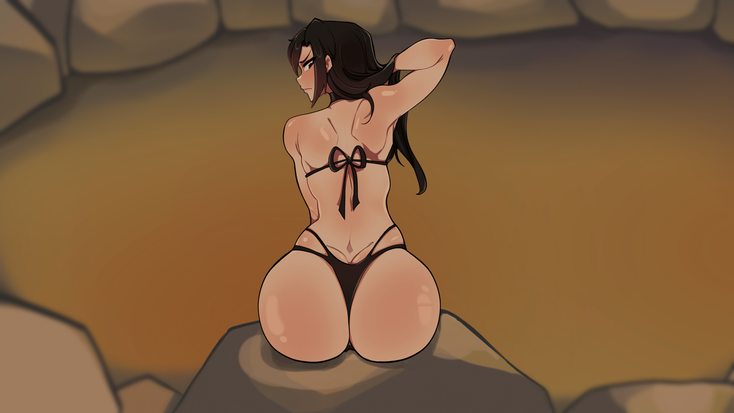
I see well best of luck then in improving both sides of the game being the lewd side and the story of the game honestly can't wait to see how it unfolds in the future and it's final result when it's a complete game though do like seeing a beautiful women from behind like it is in that pic there
I think it would be more exciting to have fewer updates but make them bigger, to have more to look forward to than just a few minutes of new stuff with each small update.
I enjoy the game as is and how promising it looks. this is mainly a preference but some type of mini games rather than the two options of continuing or repeat in those "scenes". I understand if it wont be added soon since the story has yet to be fully finished.
I think its a REALY good game just wish there was more stuff in the update
This is the feedback we want, thank you!
We're currently working on making the house just a tiny bit smaller (removing most of the in between rooms) and with that we're remaking the map. We got a new map in version 0.5 but it's not the final one (We're gonna make it a bit more symmetrical so its even easier to navigate)
I second this, when I play I find that navigating through the actual transitions can be difficult or time consuming, and the minimap is much more useful. I suspect this is just because I play at a lower resolution, but sometimes when I hover over the minimap the selected room is not actually where the mouse is, particularly near the showers. Absolutely love the artsy backgrounds that are full of detail, they make the world feel less like a game or render and more like something you might see at a real bath house somewhere.